We load packages and breast cancer survival data adapted from Leathem and Brooks (1987) (referenced by Collett (2023), p.6), and inspect the structure:
Rows: 45 Columns: 3
── Column specification ────────────────────────────────────────────────────────
Delimiter: ","
chr (1): group
dbl (2): time, status

ℹ Use `spec()` to retrieve the full column specification for this data.
ℹ Specify the column types or set `show_col_types = FALSE` to quiet this message.
Code
print(bcancer, n =Inf)
# A tibble: 45 × 3
    time status group
   <dbl>  <dbl> <chr>
 1    23      1 N
 2    47      1 N
 3    69      1 N
 4    70      0 N
 5    71      0 N
 6   100      0 N
 7   101      0 N
 8   148      1 N
 9   181      1 N
10   198      0 N
11   208      0 N
12   212      0 N
13   224      0 N
14     5      1 P
15     8      1 P
16    10      1 P
17    13      1 P
18    18      1 P
19    24      1 P
20    26      1 P
21    26      1 P
22    31      1 P
23    35      1 P
24    40      1 P
25    41      1 P
26    48      1 P
27    50      1 P
28    59      1 P
29    61      1 P
30    68      1 P
31    71      1 P
32    76      0 P
33   105      0 P
34   107      0 P
35   109      0 P
36   113      1 P
37   116      0 P
38   118      1 P
39   143      1 P
40   154      0 P
41   162      0 P
42   188      0 P
43   212      0 P
44   217      0 P
45   225      0 P
Note
Data structure for survival analysis:
time: Time in days until event (death) or censoring (last follow-up)
group: Grouping variable (Positive (P) or Negative (N) staining by HPA), which indicates whether there is potential of metastasis in the lymph nodes; a prognostic factor for breast cancer survival.
The survival::Surv() function combines time and status into a survival object for modelling.
Diagnostics
Kaplan-Meier Estimation
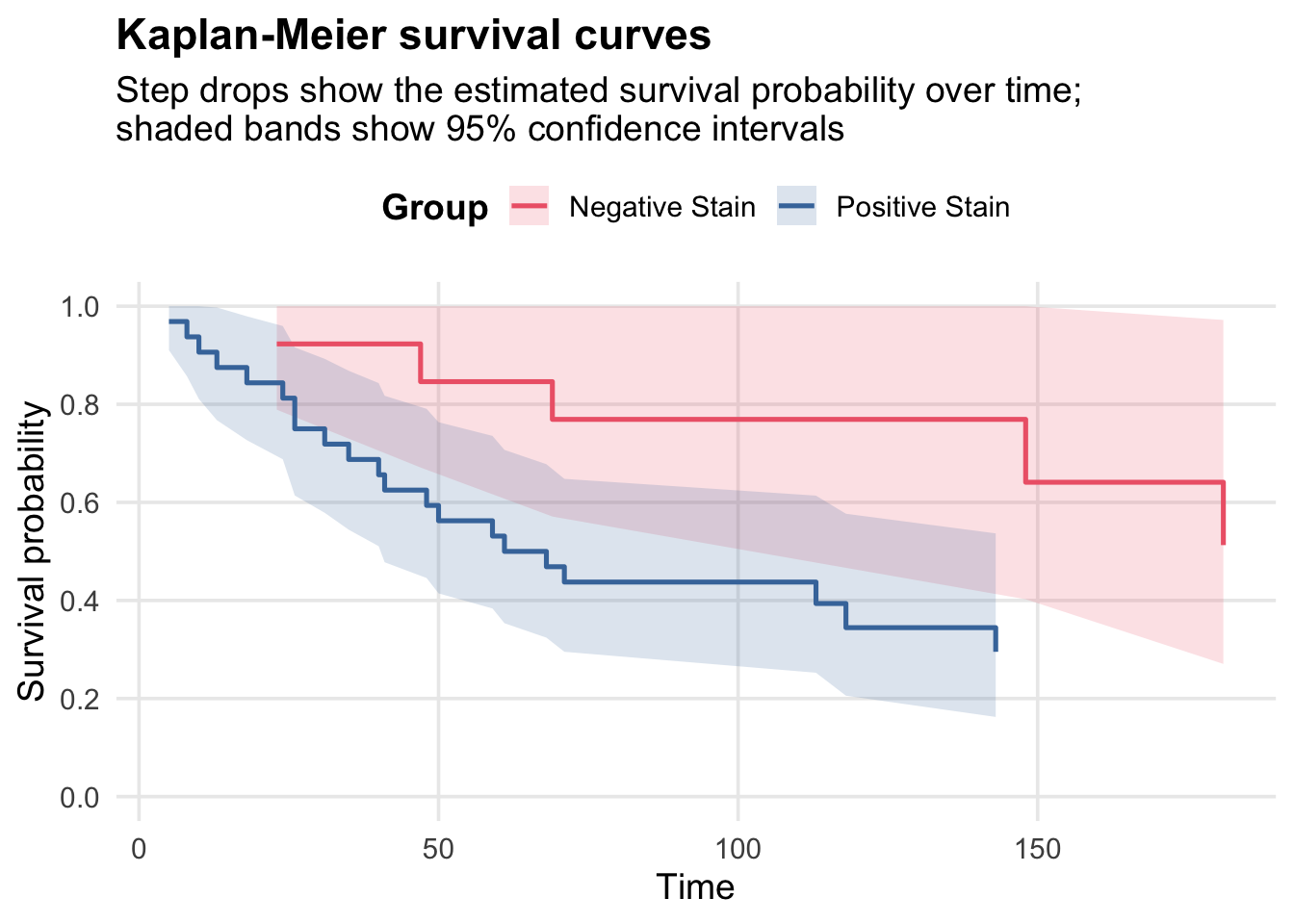
We fit the Kaplan-Meier (non-parametric) estimator for the survival function by group:
Code
cancer_km <-survfit(Surv(time, status) ~ group, data = bcancer)cancer_km
Call: survfit(formula = Surv(time, status) ~ group, data = bcancer)

         n events median 0.95LCL 0.95UCL
group=N 13      5     NA     148      NA
group=P 32     21   64.5      41      NA
Here the survfit object contains the estimated survival probabilities at each event time, along with confidence intervals and the number at risk. So for group=N at time 23, the estimated survival probability is 0.923.
n.risk is the number of patients still at risk (not been censored and not dead) just before that time, and n.event is the number of events (deaths) that occur at that time. n.risk can decrease due to events or censoring, which is why it doesn’t always decrease by the number of events.
The generic summary() method for survfit objects also has a data.frame = TRUE option which we can use and convert to a tibble for easier manipulation:
Since we’ll be making multiple survival plots, we can define a common theme and colour palette. We use colourblind-friendly colours as suggested by Paul Tol:
stain_colours <- c(...) creates a named vector: the names ("Negative Stain", "Positive Stain") must match the group labels in the data, and the values are the colours used in the legend and lines.
ggplot2::theme_minimal(base_size = 14) sets a clean base style and readable default text size.
+ ggplot2::theme(...) modifies specific theme elements on top of ggplot2::theme_minimal().
legend.position = "top" moves the legend above the plot, which is usually easier to scan for two-group comparisons.
legend.title = ggplot2::element_text(face = "bold") and plot.title = ggplot2::element_text(face = "bold") make key text elements stand out.
panel.grid.minor = ggplot2::element_blank() removes minor gridlines to reduce visual clutter.
Plot Kaplan-Meier survival curves for the two groups:
Code
ggplot(km_plot_data, aes(x = time, y = surv, colour = group)) +geom_ribbon(aes(ymin = lower, ymax = upper, fill = group), alpha =0.18, colour =NA) +geom_step(linewidth =0.9) +scale_colour_manual(values = stain_colours, name ="Group") +scale_fill_manual(values = stain_colours, name ="Group") +scale_y_continuous(limits =c(0, 1),breaks =seq(0, 1, 0.2) ) +labs(title ="Kaplan-Meier survival curves",subtitle ="Step drops show the estimated survival probability over time;\nshaded bands show 95% confidence intervals",x ="Time",y ="Survival probability",colour =NULL ) + survival_theme
TipPlot syntax walkthrough (Kaplan-Meier)
Read this plot from top to bottom as a sequence of layers:
ggplot2::ggplot(km_plot_data, ggplot2::aes(...)) picks the data and default mappings (time on x-axis, survival surv on y-axis, colour by group).
ggplot2::geom_ribbon(ggplot2::aes(ymin = lower, ymax = upper, fill = group), ...) draws the 95% confidence interval band between the lower and upper survival limits.
ggplot2::geom_step(...) draws Kaplan-Meier style step curves.
ggplot2::scale_colour_manual(...) applies the named palette so the step-line legend labels match the colours.
ggplot2::scale_fill_manual(...) uses the same palette for the confidence-band fill.
ggplot2::scale_y_continuous(...) constrains and labels the y-axis to survival-probability values between 0 and 1.
ggplot2::labs(...) adds title, subtitle, and axis labels.
survival_theme applies shared styling (legend placement, text emphasis, and cleaner gridlines).
Weibull Suitability Check
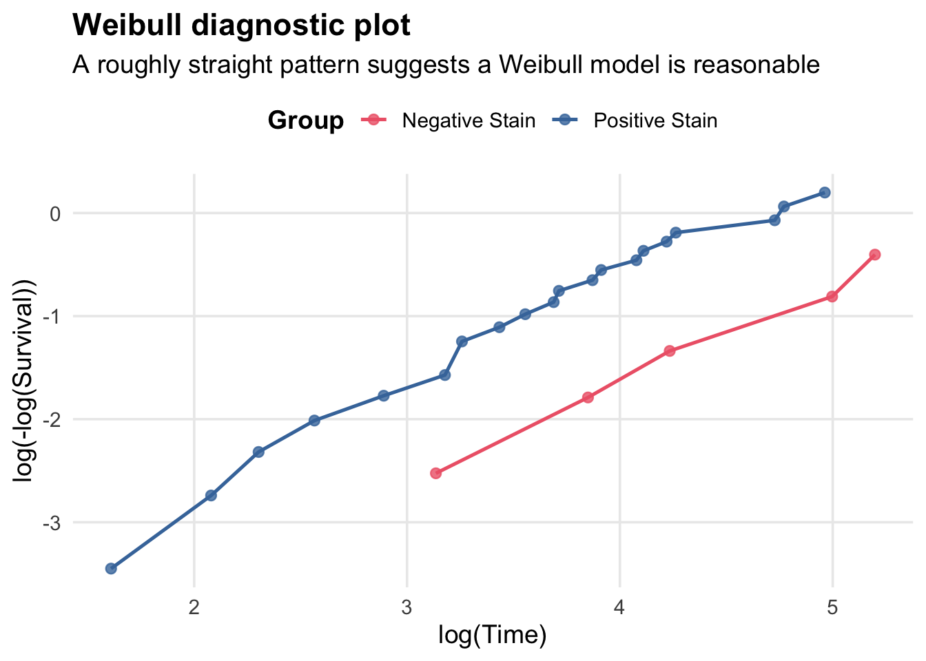
Before fitting parametric models, check if the Weibull distribution is suitable. The complementary log-log transformation of a Weibull survival curve is: \[\log(-\log(S(t))) = \alpha \log(\lambda) + \alpha \log( t),\] and so plotting \(\log(-\log(S(t)))\) vs. \(\log(t)\) should yield a straight line if the Weibull model is appropriate.
ggplot2::ggplot(weibull_plot_data, ggplot2::aes(x = log_time, y = cloglog, colour = group)) sets the data source and maps transformed variables to the axes.
ggplot2::geom_point(size = 2.2, alpha = 0.8) adds plotted observations with size and transparency controls.
ggplot2::geom_line(linewidth = 0.9) connects points within each colour group.
ggplot2::scale_colour_manual(values = stain_colours, name = "Group") applies a named colour vector and legend title.
ggplot2::labs(...) sets the plot title, subtitle, and axis labels.
survival_theme applies the shared theme object.
Here we have a roughly linear pattern for both groups, suggesting the Weibull model may be a reasonable parametric choice for modeling survival in this dataset.
Proportional Hazards Assumption
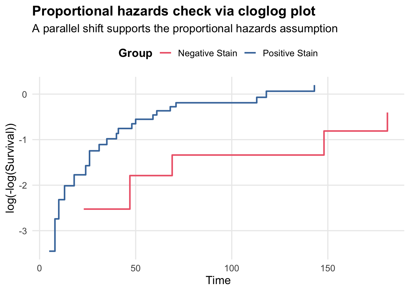
In a proportional hazards model, the hazard ratio between groups is constant over time. We can check this by plotting the complementary log-log transformation of the survival curves: \(\log(-\log(S(t)))\) vs. \(t\), and looking for a parallel shift between groups.
Code
cloglog_plot_data <- km_plot_data |> dplyr::filter(time >0, surv >0) |>mutate(cloglog =log(-log(surv)))ggplot(cloglog_plot_data, aes(x = time, y = cloglog, colour = group)) +geom_step(linewidth =0.9) +scale_colour_manual(values = stain_colours, name ="Group") +labs(title ="Proportional hazards check via cloglog plot",subtitle ="A parallel shift supports the proportional hazards assumption",x ="Time",y ="log(-log(Survival))",colour =NULL ) + survival_theme
TipPlot syntax walkthrough (cloglog PH check)
ggplot2::ggplot(cloglog_plot_data, ggplot2::aes(x = time, y = cloglog, colour = group)) maps time and the transformed cloglog response.
ggplot2::geom_step(linewidth = 0.9) draws the observed transformed values as step functions.
ggplot2::scale_colour_manual(values = stain_colours, name = "Group") uses the predefined palette and legend title.
ggplot2::labs(...) defines the title, subtitle, and axis labels.
survival_theme adds the common visual styling.
Here is it plausible that the curves are roughly parallel, which supports the proportional hazards assumption.
Exponential Regression
Now we fit parametric survival models to estimate the effect of group on survival time. The first model we fit is the exponential survival model:
Call:
survreg(formula = Surv(time, status) ~ group, data = bcancer,
    dist = "exponential")
             Value Std. Error     z      p
(Intercept)  5.800      0.447 12.97 <2e-16
groupP      -0.952      0.498 -1.91  0.056

Scale fixed at 1

Exponential distribution
Loglik(model)= -156.8   Loglik(intercept only)= -159
    Chisq= 4.36 on 1 degrees of freedom, p= 0.037
Number of Newton-Raphson Iterations: 4
n= 45
ImportantSELF TEST: What are the model assumptions for the exponential survival model?
The time-to-event follows an exponential distribution, which implies a constant hazard rate over time.
The effect of the group is multiplicative on the hazard scale (i.e., it shifts the rate parameter \(\lambda\) by a factor of \(e^{\beta}\)).
Censoring is non-informative (the reason for censoring is unrelated to the survival time).
We can test whether the slope paramter is zero (i.e whether there a difference in survival time distribution for the two groups) by using a Wald test or likelihood ratio test.
Note that lr_stat is the chisq statistic reported in summary(cancer_exp).
Here, we encountered one of those rare situations where the Wald test and LR test arrive at different conclusions under the usual test level \(0.05\). (They gave the respective \(p\)-values \(0.056\) and \(0.037\)).
Extracting Rate Parameters and Computing Survivial Probabilities
For the exponential model, the rate parameter (hazard) is \[\lambda = e^{(\beta_0 + \beta_1 \cdot \text{group})}\]:
Higher \(\lambda\) means shorter survival (higher hazard rate).
Since the survival function \(S(t)\) for the exponential distribution has the form \(S(t) = e^{-\lambda t}\), on day 100, the survival probabilities of the Negative stain and Positive stain groups are respectively
Code
exp(-lambda_n*100)
(Intercept)
  0.7388477
Code
exp(-lambda_p*100)
[1] 0.4566333
Verification: MLE via Method of Moments
For the exponential distribution, the MLE is: \[\hat{\lambda} = \frac{\text{\# events}}{\text{total time at risk}}.\] Therefore, we can alternatively compute our MLE estimates for \(\lambda_N\) and \(\lambda_P\) by applying this formula separately to the two groups:
# A tibble: 2 × 2
  group    rate
  <chr>   <dbl>
1 N     0.00303
2 P     0.00784
These match our model-based estimates, confirming that the MLE for the exponential model is consistent with the method of moments calculation.
Delta Method Confidence Interval
Recall there are two methods we use to construct confidence intervals. Here, we use the delta method (linearization). \[\text{var}(g(X)) \approx (g'(X))^2 \cdot \text{var}(X)\]
The lower bound is positive (doesn’t cross zero), which is good since \(\lambda\) must be positive. However, the delta method doesn’t always respect the natural parameter constraints; a safer approach is as follows.
Better approach: Transform to enforce positivity:
Code
# Build CI on log scale, then exponentiateexp(-(beta -qnorm(0.975) *sqrt(var_beta) *c(-1, 1))) |>round(3)
[1] 0.977 6.868
Both intervals contain \(1\), and is consistent with the Wald test above that doesn’t reject \(\beta_1 = 0\) under level \(0.05\).
Weibull Regression
The Weibull model generalizes the exponential by allowing a shape parameter \(\alpha > 0\). When \(\alpha = 1\), it reduces to exponential; \(\alpha > 1\) means hazard increases with time; \(\alpha < 1\) means hazard decreases (realistic in diseases that primarily effect infants such as malaria).
We fit the Weibull survival model, and extract some of its parameters:
Because Weibull survival function has the formula \(S(t) = e^{-(\lambda t)^\alpha}\), we can compute the survivial probability on day 100 for the two groups as:
A hazard ratio > 1 means positive-stain patients have higher hazard (die sooner). < 1 means better survival for positive-stain.
Testing the Shape Parameter
We can do a Wald test or likelihood ratio test to check if the shape parameter \(\alpha\) is significantly different from 1, or equivalently, \(\log(\alpha)\) is different from \(0\), which would indicate that the Weibull model provides a better fit than the exponential model.
conflicted: Wickham H (2023). conflicted: An Alternative Conflict Resolution Strategy. R package version 1.2.0, https://github.com/r-lib/conflicted, https://conflicted.r-lib.org/.
dplyr: Wickham H, François R, Henry L, Müller K, Vaughan D (2026). dplyr: A Grammar of Data Manipulation. R package version 1.2.0, https://github.com/tidyverse/dplyr, https://dplyr.tidyverse.org.
ggplot2: Wickham H (2016). ggplot2: Elegant Graphics for Data Analysis. Springer-Verlag New York. ISBN 978-3-319-24277-4, https://ggplot2.tidyverse.org.
readr: Wickham H, Hester J, Bryan J (2025). readr: Read Rectangular Text Data. R package version 2.1.6, https://github.com/tidyverse/readr, https://readr.tidyverse.org.
scales: Wickham H, Pedersen T, Seidel D (2025). scales: Scale Functions for Visualization. R package version 1.4.0, https://github.com/r-lib/scales, https://scales.r-lib.org.
Leathem, A. J., and SusanA. Brooks. 1987. “Predictive Value of Lectin Binding on Breast-Cancer Recurrence and Survival.”The Lancet 329 (8541): 1054–56. https://doi.org/10.1016/S0140-6736(87)90482-X.